 So what is different with the new OS2.0 that works on TI-Nspire CAS, TI-Nspire, and on the new TI-Nspire Touchpad and TI-Nspire CAS Touchpad handheld shown on the left? I just got back from a great conference in Atlanta, the Teachers Teaching with Technology International Conference where I traded in the classic Clickpad model for the improved Touchpad. The rest of this review applies to whatever Nspire handheld you have, but first why might you be interested in getting the new handheld:
1. It looks good. Yea, it is downright beautiful.
2. The Touchpad makes it easier to move the cursor. You can mouse around quickly with a large swipe or make small movements with a short swipe or make small discrete movements using click left, right, up and down.
3. The alpha key layout is easier to use and has a great feel when you press down on a key. This will be especially appreciated by those who use TI-Nspire Navigator (updated to v1.1) to answer open-response questions. People with larger fingers will also be thankful for this. The raised green buttons on the clickpad were cute, but for some they were annoying.
4. It now has the LED for visual acknowledgment of Press-to-Test. (I need to update this PTT ppt to include that info.)
5. You can use rechargeable batteries that should last 3 years. You can recharge them in several ways: plug it into a USB of your computer (in fact with this OS any handheld will run off the USB instead of the AAA batteries - Wow, I just used an Nspire that didn't have any batteries in it using 1st the USB and then the Navigator cradle. It worked great.), slide on the Navigator cradle, and ... I need to wait until education.ti.com/recharge goes live to confirm the other method. We got this link on a handout at the T^3 conference about the rechargeable batteries.
 6. Notice also the improved key layout and labels. People will call a certain button with an up arrow "shift" instead of "CAPS". My daughter commented that she likes the toggle for + - and multiply & divide. It definitely looks like there are fewer buttons; less to be afraid of. A "trig" button replaced three trigonometric buttons and will save a number of early algebra students from wondering was 'sin' they will commit if they press the button for sine. Those who use trig functions will more easily access secant, inverse cotangent and the like.
Now, on to what is new and true with OS2.0 regardless of your model ...
Let me start with Tools:
ctrl home is no longer Tools. It is now called "doc" or "Documents". Looking in there you can find several new things. (Note: You cannot access ctrl home from the new home screen. Navigator and Connect-to-Class users will be glad to know that you can log in from Settings. I told my students who asked today, "Press 5, 5 from the home screen.)
By popular demand you can now close a document. This can be done in three ways that are all quite similar to a computer.
i) Under doc, File, Close
ii) For those who know and love their short cuts, ctrl W works :)
iii) Notice the X in the upper right hand corner of the screen. Yep, that will work to close it. Move the cursor (with the new touch pad) up there and press click. (Now you can tap the touch pad in order click if you set it for that. From the home screen press 5 for settings, look in handheld settings. I like the tap. The left click under the touch pad on my computer hasn't worked faithfully for some time, so I've become a tapper.)
The emulator is a much more complete emulator. Settings can be changed. Now ctrl click works for grabbing points, lines and other objects. Moving around the screen is so much faster using the same type of method students use.
On to G&G. No longer is it Graphs & Geometry; now it is Graphs and Geometry. They are divided for ease of opening. If you want the Geometry View, you do not need to first open up G&G, press menu, View, Geometry View. Now it is just there are ready for use.

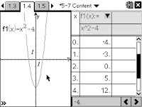
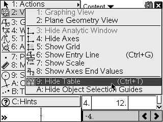
After graphing a function, you may have used ctrl T as a shortcut to see the table of values for that graph. You could find the reminder for that shortcut when you are on a G&G by pressing menu, View (look toward the bottom as shown in the image). Now you can hide the table. Make sure you have the graph screen selected and not the table part of the split screen. The press ctrl T or menu, View, Hide Table.
 Actually, I've found that removing a page or reducing a split screen from 3 to 2 or 2 to 1, etc, is a lot faster. Select the application to removed using ctrl K and press delete/backspace.
Let's talk about the new menu option on G&G - Analyze. I think this will help TI-83/84 users feel more at home when they wonder how do I graphically find the zeros, maximum, minimum, intersection, derivative, or integral. Note: Using this method you will only find one at a time. (There were, of course, great methods to find these things before. Integral is no longer under menu > Measurement, but slope is. You can still use menu > Points & Lines > Tangent, to put a tangent line on a graph and then find the slope of that to get the derivative at a point. Max, min, and zeros can still be found by menu > Trace > Graph Trace. As long as "Automatically find points of interest" is checked off on home > Settings > Graphs & Geometry. Press enter on that point of interest and the point will 'drop' with the coordinates left behind.)
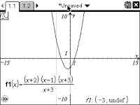
 Tracing is also improved. Try graphing f1(x)=(x^3+4*x^2+x-6)/(x+3), then press menu > Trace > Graph Trace, and type in -3.
 Notes are now INTERACTIVE too! We may refer to it as Interactive Notes. I posted a few examples of who this has made life better on the Nspire google group - see link below.
In my next blog entry I'll add some more info and let you know about the next events where teachers and students majoring in education can attend to trade-in one of their old TI-Nspire or TI-Nspire CAS handhelds. What else would you like to hear about?
Read more for yourself in the Release Notes (2.2MB). If you are a teacher, join the discussion on http://groups.google.com/group/tinspire
