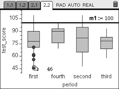
 So I put together the following to help explain the process. I figured others would be interested in how to do 'bnw' on the same screen with the same scale, so here is a description of what I did and what you see happening in the image to the left.
Last semester, my first 4 periods took a test. Like most of my multiple choice tests, students can score 110 out of 100. Our school has a pretty tough grading scale and some multiple choice questions can be tricky. Fourth period is an AP class that already receives a weighted grade, so they didn't get the blessing of 10 possible bonus points on their AP-like test.
I don't teach box and whisker graphs in any of my math classes, but I do use them for myself and for students to get a picture of how they are doing compared to their classmates. It enables you to quickly see things like what were the top 25% scores, or 3rd quartile, and what the median or middle score is. By moving the mouse around on this TI-Nspire Data & Statistics page, the top score, Q3, median, Q1, and lowest score appear. Q3 and Q1 stand for 3rd and 1st quartile.
 If you click one of the sections, you see the data points appear. You can see that I added a movable line to show where the 100 point mark was. This can be done on the handheld by pressing MENU>Analyze>Add Movable Line.
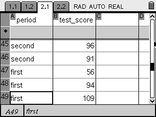
The key to graphing anything on a Data & Statistics page is that the information in the list and spreadsheet needs to have a title. In other words, a variable needs to be assigned to the data. For multiple box and whisker plots with the same scale, use categorical data. I put the period in the first column and listed the grades in the class in the second column.
There is a nice shortcut to entering the same thing in multiple cells in this spreadsheet that behaves extremely similar to and Excel spreadsheet. On the handheld press CTRL+(Click), that is CTRL and the circle in the middle of the Navpad. There are more details about this shortcut in the "Tips & Tricks" section of the Spring 2008 Nspiring Times (page 14). Past issues can be found on the bottom of this page of the tinspire.com website.
These box plots can be graphed vertically or horizontally as seen on the last picture in this article. It is fun to watch the data move when the variable is changed by clicking on it. This is shown in a short video here.

1 comment:
This is very helpful. Thank you!
-Andrew Borne
MN
Post a Comment